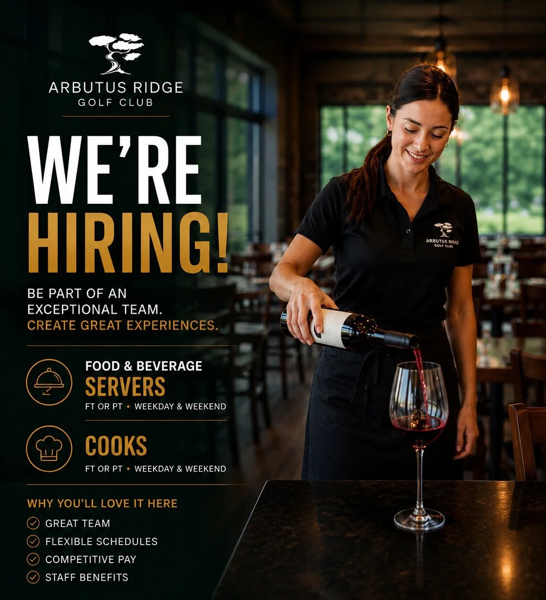
Let’s Work Together,
Submit your application using this form or to scozens@arbutusridge.com for servers & chef@arbutusridge.com for cooks.
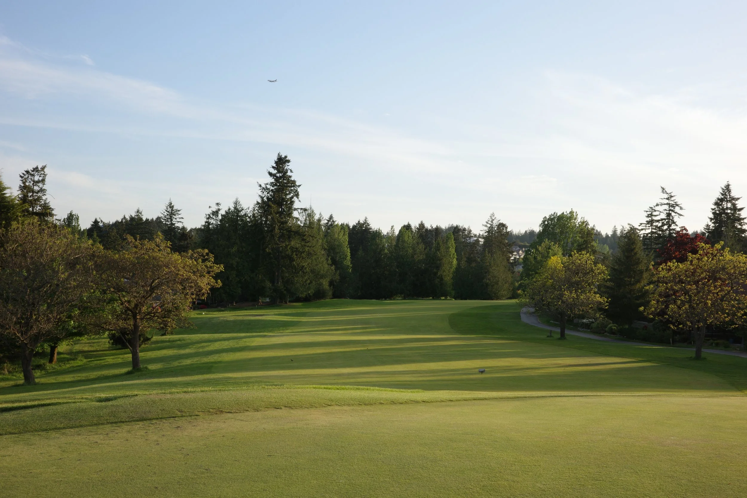
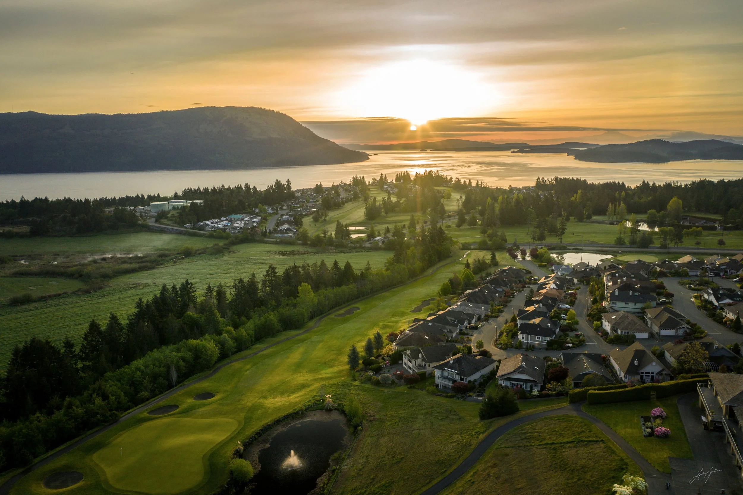
Bill Robinson Design, Built in 1987
18 Holes | Par 70/72 | 6,152 Yards | Rating: 70.9 | Slope: 123
Nestled in beautiful Cobble Hill, ARGC offers a thoughtfully designed golf course, stunning ocean views, and welcoming amenities for golfers of all levels.
Discover Our Membership Options
Enjoy what our course has to offer, then visit our clubhouse for additional amenities, events, and a welcoming community of golfers.
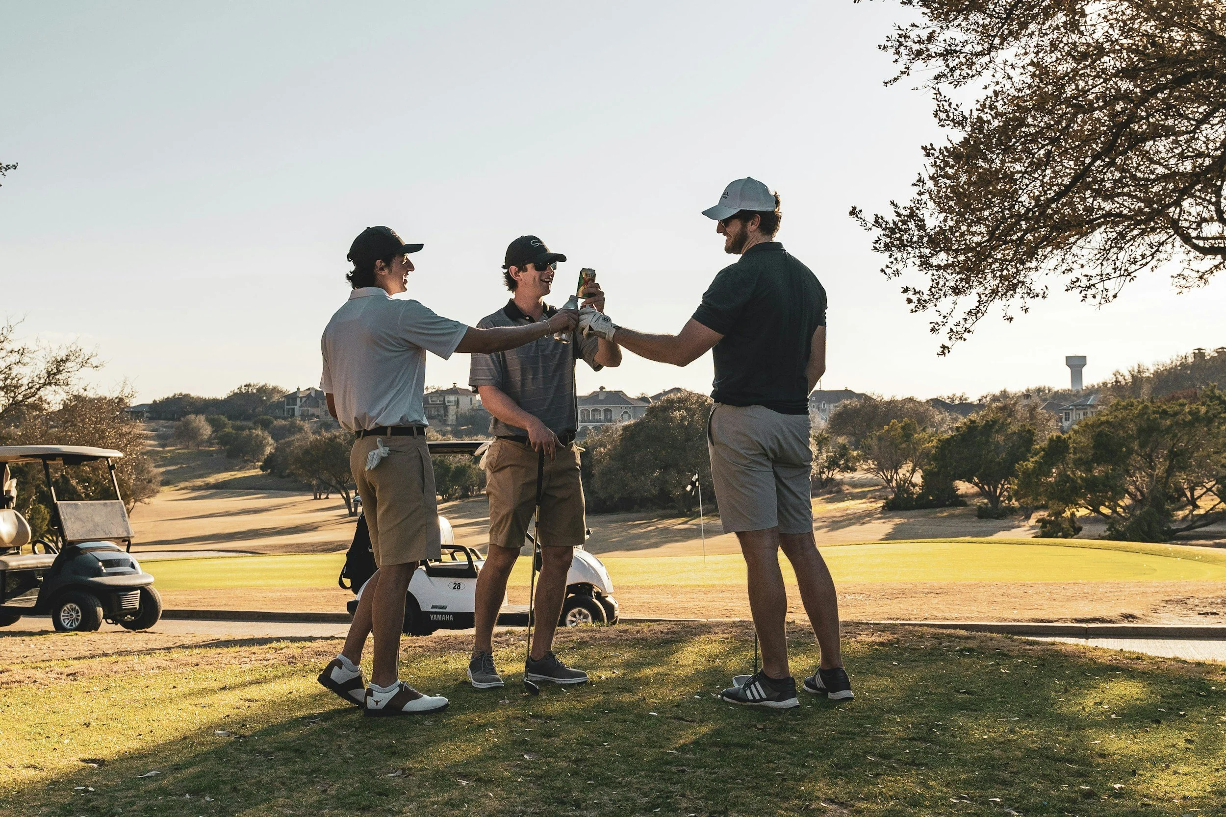
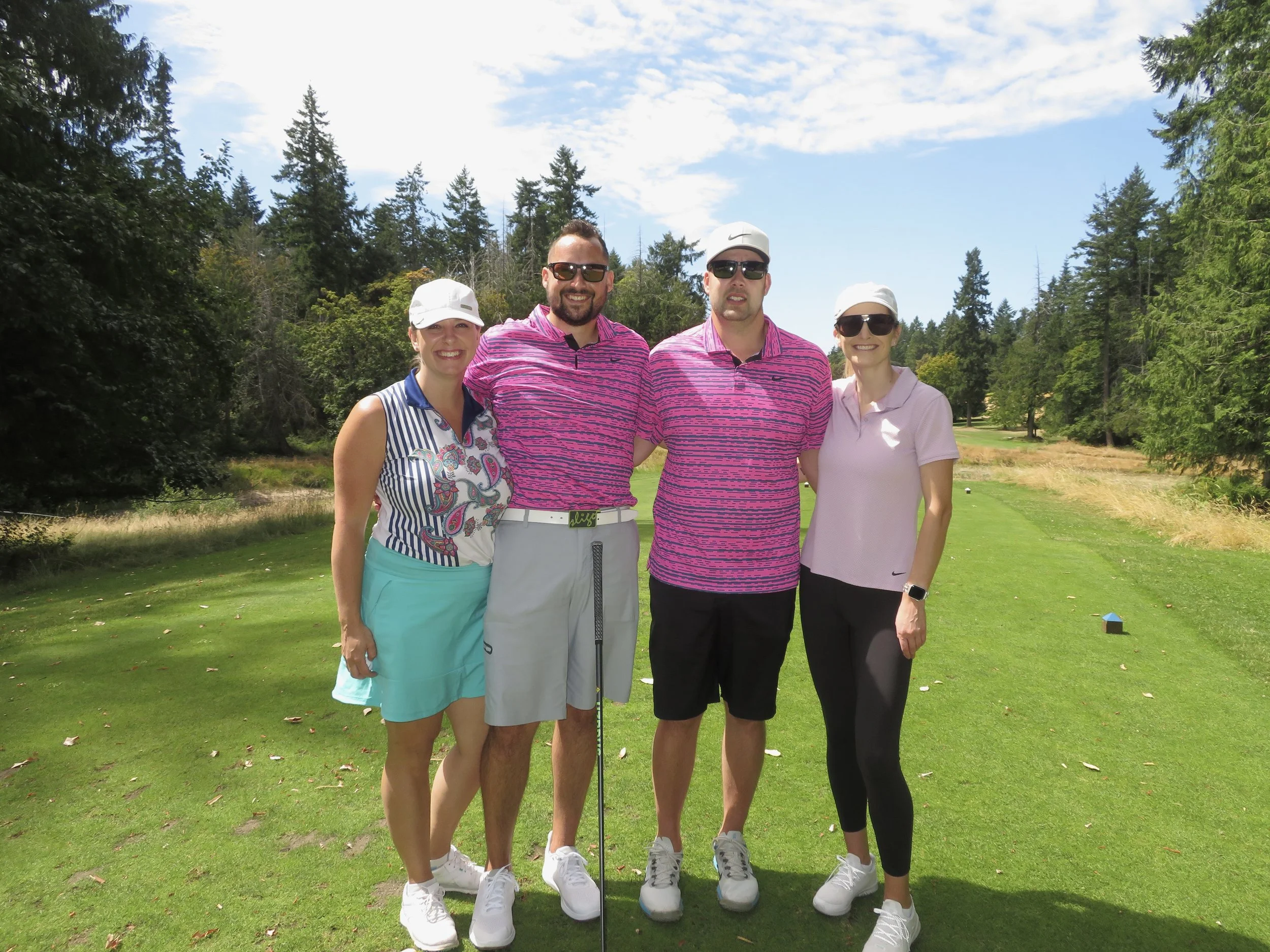
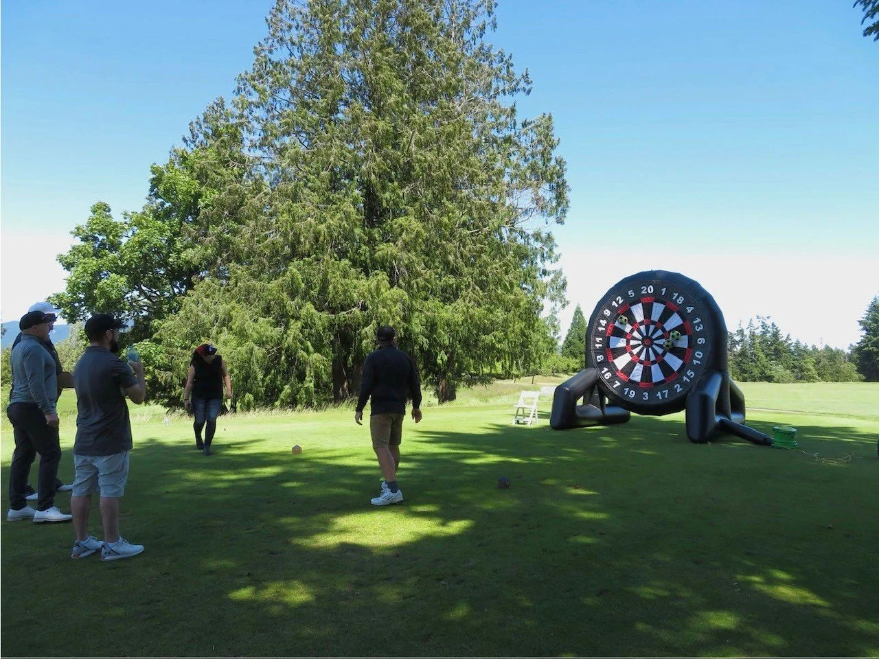
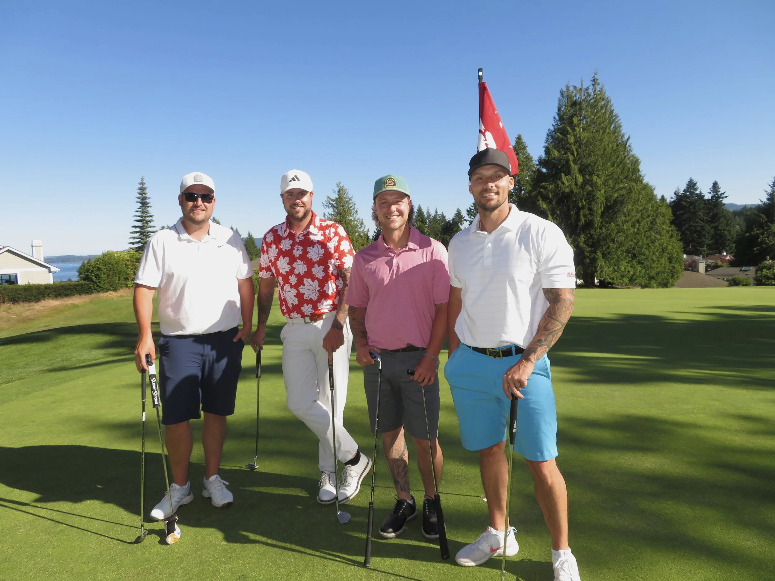
Golf Events
Arbutus Ridge offers the ideal setting for memorable golf events, combining stunning coastal views with professional service just 40 minutes from Victoria. Whether hosting a corporate tournament or friendly gathering, our championship course, elegant clubhouse, and outstanding dining create the perfect blend of sport and hospitality. Contact us to discover how we can make your next golf event exceptional.
Our facilities accommodate groups of up to 144 golfers. Golfers will be delighted by ocean views and challenged by memorable terrain. Wind down the day in Arbutus Ridge's Clubhouse overlooking the 18th fairway, Satellite Channel, and unforgettable Mount Baker.
Leagues

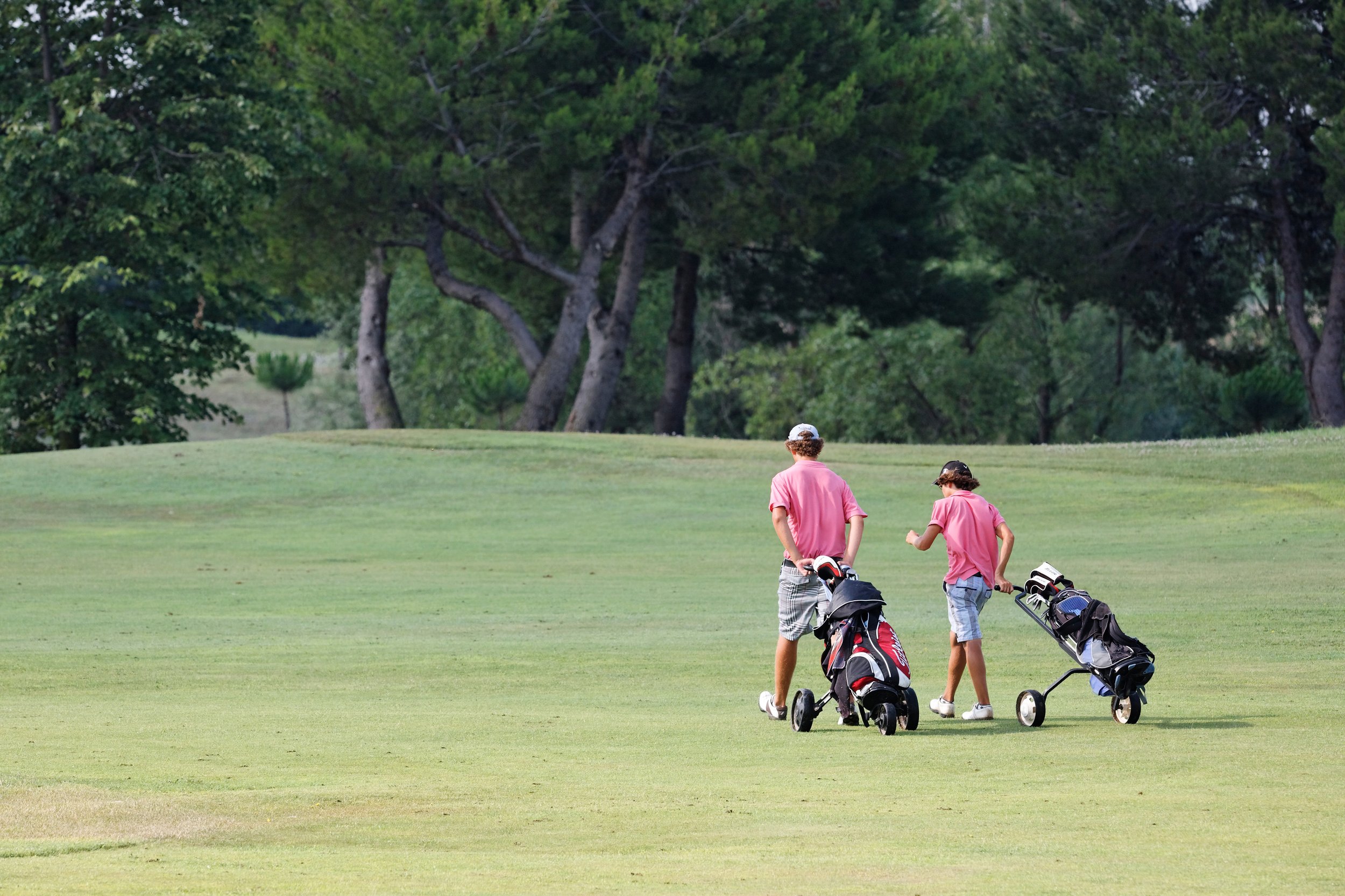
Juniors at ARGC
Helping young golfers develop their skills and love for the game.
Our Junior Academy offers something for everyone - from our Little Bogeys program where 4-6 year olds get their first taste of golf, to weekly clinics for ages 7-14, and even our popular summer camps that mix golf and tennis for a full morning of activity.
Whether your child is curious about golf or already showing serious potential, our professional instructors know how to meet them at their level. We've designed these programs to build skills progressively, and the best part is seeing kids grow more confident with every session. Want to celebrate a birthday? Our S.N.A.G. golf parties are a hit with the kids and super easy for parents to organize.
EVERYDAY
9 AM - 8 PM
Awards & Distinctions:
Golf Shop of the Year - Vancouver Island, PGA of BC, 2021
Employer of the Year Award, Tourism Vancouver Island, 2017
Host of the BC Junior Boys Championship, 2016
Rated #2 in Canada - Reader’s Digest Top 13 Golf Courses in Canada 2012
Host of the CN Future Links Championship, 2011
Host of the British Columbia Provincial Women’s Amateur / Mid Amateur Championship, 2010
2nd Place in Customer Service at the Duncan - Cowichan Chamber of Commerce Black Tie Awards 2009
Sustainability Award, Tourism Vancouver Island 2009
One of Canada’s Ten Best Golf Courses for your Money, UP! Magazine 2009
4 star rating for “Best Places to Play”, Golf Digest 2009